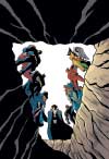
Wednesday, May 10, 2006

INTERVIEW: Who has a CRUSH on Jason Hall?

[Interview for Toon Zone News: 24th October 2003]

CRUSH is the sixth title to be released through Dark Horse's new adventure comic line - Rocket Comics. This dark tale is the latest project from comic writer Jason Hall. Along with Star Wars Tales artist Sean Murphy, CRUSH takes us into the deeply confusing life of a young teenage girl who has to come to terms with the monster that lurks within her.

Toon Zone recently spoke to CRUSH writer Jason Hall about the new title.

Toon Zone: How did you get involved in writing CRUSH?

Jason Hall: I had been doing a good deal of work for editor Dave Land with my stories regularly appearing in STAR WARS TALES. He liked what I was doing on those and I think we both wanted to work on something together that wasn't Star Wars. When he and Dark Horse decided to start their ROCKET COMICS line of books, Dave asked if I'd be interested in doing one and I told him I was definitely in. I was given the very basic couple sentence pitch/premise for CRUSH and was told to run with it. And that's what I did -- creating the world of the book, the story direction, the back story, etc., from the ground up. It's been a lot of fun.

TZ: What will make CRUSH stand out above the rest?

Hall: CRUSH is about dealing with all different types of monsters: both the everyday (abusive parents, paranoid neighbors, high school punks) and those that are more "out there" (deadly agents of mysterious organizations, giant brutish goliaths, and nerdy teenage wolf creatures). and while most of us may be able to keep that "monster" we've all got inside of us in check, Liz Mason literally finds herself unable to do this. She's got a lot of built-up frustration and rage inside of her -- and because of a startling transformation on her eighteenth birthday, it's all coming to the surface. And it just may lead Liz to discover the terrible truth about her past and who she really is. Actually, you can probably bet on it!

In it's own way, CRUSH deals with all the self-discovery and change everyone goes through when becoming an adult -- physically and mentally. Liz's life is spiraling out of control in so many was, and I think that's something we can all relate to. But it's not all "oh, it's so hard to deal with change, woe is me!" Not at all. The book really does have it all -- there's action, humor, suspense, mystery, drama, romance, a bit of horror -- so hopefully there's something for everyone in there. At the same time, I think it's the introspective and emotional side of the book that will make it stand out as something different. All the ROCKET COMICS titles are pretty varied in genre and theme, etc. -- and I'd have to say that CRUSH is very different from what's come so far. It's definitely its own entity. I like to think of it as the "black sheep" of the ROCKET COMICS family. And I mean that in a good way!

TZ: From the images I've seen, Sean Murphy has done some great work on the title. What did Sean bring to the final product from the perspective of the writer?

Hall: Sean does a great job with visual story-telling. There are many sequences in the book that even without any dialogue you could easily follow the gist of the story. I write full-script -- and my scripts tend to be pretty detailed, but Sean has also added a few little moments here and there in the art that drives home the emotion of a scene. The art needs tell the story in conjunction with the writing and not simply rely on the writing itself to get the story across. I'm not a fan of comics that have large panels with two characters talking back and forth so the one panel is filled with a ton of dialogue balloons. That just might as well be an image with some text. Comics (to me) should be more than that -- and it's the writer and the artist working together and communicating that allows that to happen.

TZ: Female lead characters becoming more popular in comics. Does that make defining a memorable female character such as Elizabeth Mason more difficult?

Hall: I don't think so. I enjoy writing female protagonists, as evident from BEWARE THE CREEPER and PISTOLWHIP: THE YELLOW MENACE, and CRUSH itself not only has Liz, but also her best friend Jen Tanaka and the deadly Agent Bixby. But I don't think you can really go into it thinking "I need to make this character memorable" -- you just write characters that you feel are interesting and hope readers feel the same. I always hate to break anything down into its parts because then it becomes more of a science experiment than writing a story. I don't believe in formula at all. I just do what I think is best and most entertaining.

TZ: How does writing an original tale like CRUSH compare to writing for an already established universe such as some of the DC/Dark Horse titles you work on?

Hall: Well, there is certainly the freedom of having an entirely open slate from the start. On one hand, it's always fun to be able to write stories featuring iconic DC or Star Wars characters -- especially when you've always enjoyed those characters yourself. But with your own "world", you get to decide what happens to each an every person in it. You get to map out the future as well as the past. You can't go and cut off Batman's arm, but if I want to cut off Liz's arm in a story, there's no stopping me! That's what makes the PISTOLWHIP stuff (with co-creator Matt Kindt) so much fun as well -- it's your own world to play in. And I'm having a great time both creating and playing in the world of CRUSH.

But with most comics, their fate depends on sales and there was no guarantee how long CRUSH would go on -- but I made the decision to write the book as an on-going series for which I was in for the long-haul. I really strove to create characters with some depth and plenty of secrets. I basically put together an entire mythology for the book. This first four-issue arc is just the beginning of a much larger story that I'm eager to tell. I hope the book has a long life because I'm really looking forward to delving more into her character and past. Every character has a story to be told, a history to be revealed and examined, and I'm hoping to get the chance to tell those stories down the road. The first story-arc has a lot of surprises and revelations but also raises a number of new questions and mysteries, and I think the reader is going to have a lot of fun taking this journey with Liz.

Let's all hope it's a long one -- and you can help make it last by picking up a copy on October 29th!

TZ: Any projects you are also currently working on you'd like to tell us about?

Hall: I've got my second issue of JUSTICE LEAGUE ADVENTURES coming up in #28 -- with artwork by Min S. Ku and Ty Templeton (I've seen Min's pencils, and they're phenomenal!). And it features The Legion of Super-Heroes! I've also written a follow-up to my Mr. Freeze story from GOTHAM ADVENTURES that will be appearing in an upcoming issue of BATMAN ADVENTURES, with artwork by the current cover artist on that book, Kelsey Shannon. I also just had a story in the recently released STAR WARS TALES #17 with artwork by Ben Templesmith, and I'll have stories in #18 and #19 as well. Plus, I've got a short two-part story featuring my favorite Golden Age character coming up, as well as a potentially major project that I can't announce just yet until it's official. I hope everyone will check that stuff out!

TZ: Finally, CRUSH deals with the manifestations of monsters. Is the CRUSH character Agent Bixby's name homage to TV's Incredible Hulk actor, the late Bill Bixby?

Hall: But of course!

CRUSH #1 was released on Wednesday 29th October 2003.

INTERVIEW: Aquaman author talkes Justice League Adventures: Friend of Foe?

[Interview for Toon Zone News: 8th January 2004]

Matthew K Manning is a comic book writer probably most asscoiated by mainstream comic audiences for his work on Justice League Adventures. With two new trade paperback compilations of the Justice League Adventures being released later this month, Matthew speaks to Toon Zone about his popular Aquaman story An Angry Tide, which is featured in the second volume, Friend Or Foes.

Toon Zone: It's been a couple of years since you wrote "An Angry Tide." How do you feel about it retrospectively? Do you think you'd have approached any elements differently now?

Matthew K Manning: Like anything that I worked on in the past, I'd change a few things here and there. When I originally wrote the script, the Justice League cartoon hadn't even aired yet, so I probably would have altered the scene where the Martian Manhunter morphs into Aquaman. I still really like that idea, and I think it still works very well in the context of my story, but the same thing kinda' happens in the Aquaman episode of the series. But I'm no George Lucas or Stephen Spielberg, so I leave my work the way it originally was and I move on.

TZ: What sort of reception have you received to your work on Justice League Adventures? I recall the feedback at the time was rather positive.

Manning: So far it has been pretty positive. My favorite comment was from a lady whose son was a big fan of the Justice League cartoon, and who'd come across a signed copy of my issue. Her son sleeps with the comic at night. That's about the best praise anyone can get, really.

TZ: If you had the choice of any established comic book to write for at the moment, which would interest you the most?

Manning: That's a really tough question since I'd love to someday get the chance to contribute to most of the titles I read. Right now I'd probably say Nightwing, because he's like a Batman you can relate to. Either his title or Batgirl's, since they've only really scratched the surface on her personality. With Batgirl you'd have a lot to work with and much more freedom than most of the other big name superheroes.

TZ: When you last spoke to Toon Zone you said you were hoping to return to Justice League in the future. Is this on the cards? If the opportunity arose, would you be interested in picking up Aquaman again, or would you prefer to move onto a different aspect of the Justice League universe?

Manning: Actually, I sold my second script to Justice League Adventures several months ago. Since he juggles so many different artists and writers on his book, my editor, Steve Wacker, is able to have several different issues in progress at the same time. Of course, I always try to simplify his life by offering to take the book off his hands on a monthly basis, but he always mumbles something about other writers needing to feed their families or something and quickly hangs up the phone.

In all seriousness, I'm very excited about my second issue. It sports the art of Tim Levins and deals with Robin's first encounter with the Justice League. I've seen Tim's pencils and what he does with the animated style it just amazing. This issue easily tops my last one since I had a bit more time to flesh out the plot, and Tim just makes everything flow perfectly. Just don't ask me when it's coming out, 'cause I don't know.

TZ: Is there a method to your madness? How do you approach writing for an established series?

Manning: Actually if I had had to choose which comic would be the toughest to write for, hands down I would have chosen Justice League Adventures. Here you have the most powerful characters on the planet, so you have to find a challenge big enough for them, but you can't really change the status quo because it has to tie in with the show, and more than any other comic on the market, you have to make this book very appealing to kids and adults simultaneously. It was a very daunting task when editor Dan Raspler asking me to submit proposals for it. But it was my first venture into mainstream comics, and since I absolutely love the Bruce Timm animated shows, I jumped at the chance. Now I'm at the point where I can't stop thinking up ideas for this series. I just hope I get the chance to do a few more in the future.

TZ: Are there any other projects you are pitching or working on you'd like to tell us about?

Manning: I have one pitch in at DC right now, but most of the stuff that's occupying my time is in the underground category. We're just now finishing up my new special for Meathaus Comics entitled For Best Results: Do Not Open, that should be solicited in about three months in Previews and be for sale at www.meathaus.com in about one month. I'm also contributing an eight-page story to the 8th Meathaus annual, as well as a four-page little story for a charity book for Avatar. It's keeping me busy, but I'm always working on one or two mainstream proposals. Just nothing I can fill you guys in on yet.

TZ: Finally Aquaman's beard: Yay or nay?

Manning: The look I like for Aquaman is the beard, the long hair, and the orange uniform without the gloves. But any look where he's not wearing that tiara is all right with me.

Justice League Adventures Vol 2: Friend Or Foes was released on January 21st 2004

ARTICLE: The Phantom Stranger Guest Stars in Justice League Adventures Issue 31!

[Article for Toon Zone News: 2nd March 2003]

Justice League Adventures #31, which is scheduled to be released in early May, will guest star The Phantom Stranger. It's an issue Justice League penciller Chris Jones is very excited about.

"Justice League Adventures #31 is a very special issue for me, in that it gave me a chance to work on the Phantom Stranger," explained Chris in a recent correspondence with Toon Zone. "I've always liked the character, and years ago I did samples in the WB Animation style that included designs for an animated Phantom Stranger.
Those samples were seen by Dan Raspler and ended up helping me get my first work for DC Comics doing fill in issues of Raspler's Young Heroes in Love.

"A few years later, when I had started doing issues of Justice League Adventures, I mentioned a number of times to editor Steve Wacker that if he ever got a script for a Phantom Stranger story, I wanted it. Finally, Steve paired me up with writer Josh Siegal and had us concoct a Phantom Stranger story for the book. Josh and I talked about what we liked about the character and stories he'd appeared in, and Josh did a fantastic job of creating a new story that contained a lot of those elements. It was a lot of fun to draw and is one of my favorite things I've done for DC Comics."

Justice League Adventures #31 will be released in May. This week sees the release of Justice League Adventures #29, written by Matt Howarth, with art by Aluir Amancio and Rob Leigh, and a cover by John Delaney and Leigh.

INTERVIEW: Jason Hall speaks about storywriting!

[Interview compiled for the Toon Zone Storyboard Forum: 17th April 2005 - interview was complied a lot earlier with Jason, maybe even late 2004]

Jason Hall, co creator of the popular Pistolwhip series of comics and graphic novels, has written for many major imprints and publishers. Hall is most commonly known by Toon Zone visitors for his stints on numerous DC titles such as Batman Adventures, Justice League Adventures, Detective Comics and the Vertigo imprinted Beware The Creeper. He has also written for the Star Wars franchises published by Dark Horse as well as create the comic title Crush for Rocket Comics. His most current stint was on the creator-owned monthly series Trigger that premiered in December under the Vertigo imprint.

Ladies and gentlemen, Jason Hall was kind enough to take time off his busy schedule and answer a couple of questions for the Story Board that might help you in your creative writing =)

JAMES: What do you do to relieve writer's block?

JASON: I either work on something else, or read a book or watch
something else or listen to certain music (that's always a
good one!) that might inspire me or spark something in
me to get past the writer's block -- or I talk the story/idea
over with a friend of mine or my wife and get their opinion
and they end up being a great sounding board that allows
me to come up with new ideas I hadn't thought yet. Talking
it through with someone is always a big help.

JAMES: How did you get started?

JASON: I co-created Pistolwhip Comics with my pal Matt Kindt, and
we did mock-ups of our first two books that looked like actual
published books and we gave them to publishers at the Comicon.
Top Shelf loved them, thought they were already published books
that they were just getting comps of, then realized they weren't
and signed us on the spot with our books as is. No changes or
anything needed (except a cool new cover for one of them). And
we have total creative freedom with them on the Pistolwhip stuff,
which is nice (and something you don't get with any mainstream
publisher). The books were well-received by both critics and
readers (which was really great to see!), even getting a couple
Harvey Award Nominations. Based on my work on "Mephisto
and the Empty Box" (one of those previously mentioned
Pistolwhip books), I got to submit a script for Star Wars Tales
(which the editor loved, but couldn't use because it was too
similar to something already coming out -- but that led to getting
to send in another idea, which was approved, and led to doing
a total of nine stories for SW Tales over the last two years or
so) -- and based on both "Mephisto" and my first SW Tales
story, I got the editor of "Batman: Gotham Adventures" to
agree to read a complete script I wrote for that book, which
she really liked and decided she wanted it for the book right
off the bat (and that story is my first Mr. Freeze story from
B:GA #51 -- which you'll see the exciting follow-up to in
"Batman Adventures #15" this June!). And from those two
things, I was able to bring my work to the attention of other
editors, and that led to "Beware The Creeper", "Justice League
Adventures", "Crush", "Detective Comics", and more (and at
the same time, I contiued to work on the creator-owned indy
stuff, writing "Pistolwhip: The Yellow Menace", which was also
well-received and gave me yet another project to show to editors
at the bigger companies). But it was A LOT of hard work and
persistance and determination. None of it comes easy (or maybe
it does if you know people, but I didn't -- I started from scratch).

JAMES: What inspires you to write such great stories? Any pointers?

JASON: Well, I can't say if any of my stories are great or not (but thanks
for the compliment!) -- but as far as inspiration goes, I try to write
the stories that I'd like to read. But because there are other hands
in the process, the end result might not always be exactly what you
imagined or were hoping for (sometimes for the better and
sometimes for the worse). And I never write anything according
to any kind of "formula". I don't think of stories divided into acts
(at least not in a formulaic way) and I don't think a story has to
have certain elements in certain places throughout -- when you
start breaking it down like that, I feel the end result can wind up
being kind of cookie-cutter. I think that's why so many Hollywood
movies are so bad and clichid. I just write it -- sometimes in pieces
which I rearrange and build a story from, or sometimes from start
to finish -- always in an outline first, which becomes kind of a road
map for the script (although you usually find yourself thinking up
new/better ideas or ways to do things as you're writing the script,
which keeps that part interesting as well, and not just expanding out
something you've already got down) -- and things are never set in
stone, because there's always room for a new idea or a different
way to do things.

The only advice I can give, for what it's worth, is to write what you
like -- write the kinds of stories that you would pick up off the rack.
Sometimes that's not always possible (hey, we all need to pay the
rent, right?) -- but even if you find yourself working on a project that
may not necessarily be something you'd buy yourself, you can always
do your best to make it something interesting to you and different than
what might normally be expected.

REVIEW: Duck Dodgers Season One Overview

[Review for Toon Zone News: 3rd January 2004]

Some called it a bold step. Others -- rather aptly -- declared it "looney." Whatever the opinion, Duck Dodgers has made it through its first season. So how did it fare? Did the creative team that dreamed up and produced the show manage to take these iconic characters from a future located in the past and bring them successfully into the present?

For those who missed Daffy and Porky’s original outing, or if you are simply from the UK, allow me to summarize.

The show is based on the classic 1953 Warner Bros. short “Duck Dodgers In The 24th ½ Century," starring Merrie Melodies' regulars Daffy Duck and Porky Pig, with Marvin the Martian in villainous support. The short spoofed the rather glitzy science fiction that swamped cinema screens at the time with a ruthlessly simplistic tale about the battle to possess a single planet. Except for a rather uninspiring sequel in 1980, it’s been fifty years since we've heard from Dodgers.

When unveiled, the show promptly came in for heavy criticism from the Looney Tunes fan base. Times had changed, and so had people's expectations about cartoons and cartoon humour. Many felt the new show relied too heavily on verbal banter and lacked the slapstick humour of the original. Others questioned the quality of the animation and some of the visual redesigns. Such harsh scrutiny isn’t unusual, however; remakes and revamps always rest uneasy with the avid fan.

Just as the original short poked fun at 1950s science fiction, the new series shows no fear in doing the same with contemporary sci-fi, which provides a terrific resource for the show to draw on. Indeed, the first season sprang many identifiable science-fiction in-jokes on us. Some of them were subtle pieces of dialogue or tiny visual references that only dedicated fans would get. The battle on the bridge in "Duck Codgers" reeks of The Phantom Menace, for instance, and Dodgers' outfit in "Enemy Yours" is reminiscent of Dr Doom’s from Marvel Comics. Some episodes are actually keyed to infamous sci-fi moments. Star Trek‘s "The Deadly Years" and "Spock’s Brain" are both decimated in "Duck Codgers" and "They Stole Dodger‘s Brain," respectively. "The Green Loontern" is based in the same universe as DC Comic’s Green Lantern series and stars the title's heroes and villains. Another noteworthy source is Star Trek II: The Wrath Of Khan, which has its title spoofed in "The Wrath Of Canasta," is cheekily quoted in "The Foul Friend," and has one of its final battles mimicked virtually scene-by-scene in "The Queen Is Wild." There is something for every sci-fi fan, but if you know your Trek, you‘ll probably get more of the sneaky references.


The show wasn’t above self mockery either. Dodger’s inability to recognise the disguised Cadet in "Big Bug Mamas" references the inability all Looney Tune characters have at recognising a friend or foe who is cunningly decked out in a wig and lipstick. "The Wrath Of Canasta" is both an homage to the 1951 Daffy and Porky short "Dripalong Daffy" and a satire of the cult film WestWorld.

The season provided a variety of guest characters from outside the original cartoon. Some characters will be at least slightly familiar to regular cartoon viewers. We’ve had cameos from Yosemite Sam, Nasty Canasta, Dr. Woe, the Goofy Gofers, Marvin’s faithful hound K-9, and those wonderful instant Martians. We have also seen some great new characters added to the universe -- the Martian Queen (Tia Carrere), and those robots voiced by Star Trek’s Michael Dorn.

For a series based on a five-minute cartoon, there was clearly an effort to experiment with duration. Of the thirteen episodes, ten were split into a two-story format while the other three episodes developed over a full twenty-five minutes. Overall, the quality of the episodes has been good, and some have been fantastic. In my opinion, the animation and production have been of high quality. The theme tune and opening credits certainly are the finest I’ve seen this year.

The show also benefits from a strong and reliable cast. Joe Alaskey and Bob Bergen are top-notch, and we are also treated to some great semi-regular and guest-starring roles from the likes of Michael Dorn, Kevin Smith, Tia Carrere, John DiMaggio, Lauren Tom and Tara Strong.

The main characters have all got off to a good start and the interplay between them has been refreshingly varied. Dodgers -- a character whose lack of charm and talent could have become tiresome very quickly -- is unpredictable and quirky. Sometimes he is the most useless imbecile in the galaxy, while at other times he shows himself the hero we’d expect to bear a title in the Protectorate. The same goes for Porky’s Space Cadet. To my pleasant surprise, he wasn’t there to constantly save the day, and he would even occasionally show himself to be as stupid as Dodgers (okay, perhaps not that stupid). By not making the characters too rigid, they have kept each story from becoming too formulaic.

The scripting feels as if the writers are conscious that they must keep the show interesting and not fall into formula. "Quarterback Quack" deals with time travel; "The Wrath Of Canasta" takes us to the Wild West; "K-9 Kaddy" takes Marvin golfing on Mars and into an unwitting battle with a pair of Martian gofers. Whether you feel this is the Duck Dodgers of the past's own future, one cannot deny that every attempt has been made to keep the show fun and diverse.

To be fair, in one respect the show does occasionally fail: the structure of its plots. With the 24th ½ Century now being a far richer place, it seems the writers get a little too bogged down with fleshing the story out to the detriment to the humour. "The Green Loontern" is perfect example. It’s an episode which has a nice idea and oodles of in-jokes, but it just spends too much time being a proper story and not enough time playing for gags. I found each of the extended stories suffered this way, with the jokes dragging and the story swamping the dialogue. If the first season has provided any lesson, it is that the stories suit a short format rather than a longer one. I found the other two longer shows -- "Hooray For Hollywood Planet" and "Shiver Me Dodgers" -- both slow and tiresome. Indeed, I must agree with criticism that the show can be on occasions too mouthy -- a little more visual humour would be good. Overall, it's true that Duck Dodgers is very dialogue heavy.

But humour is a subjective thing, of course, and I’m pretty sure that each episode offers a joke for someone. I may not have laughed at every line, but I finished most of the episodes feeling pleasantly amused. The show is not stomach-burstingly funny, but it is very enjoyable.

I’d have to recommend "K-9 Kaddy" as the best story of the season. For me, it captured the simplicity and charm of the Warner Bros. cartoons I watched as a kid. It was a delight to see the Goofy Gofers again, and while the story was pretty vacant, the jokes were plentiful. Marvin and K-9 were also on top form -- a pure treat. Other gems this season included "The Fowl Friend" -- which offered the most politically incorrect resolution this side of South Park -- and "Big Bug Mamas." As for the show's characters: while Marvin will always be my favourite, the Martian Queen was really proving her worth by the end of the season in stories like "The Queen Is Wild" and "Enemy Yours."

Reinventing Duck Dodgers was a daring exploit, and thanks to some good writing, strong production values and a great cast, they have done a fine job. It’s not a perfect show, but hopefully the team will have learned from its mistakes this season and will produce a second that is more consistent. Duck Dodgers is a great place to go for sci-fi parody and humorous jibes. Put away your expectations for a return to the Golden Age of Warner Bros. and just sit and enjoy this fun cartoon. You’ll have a good time.

REVIEW: "Duck Dodgers": New Series Brilliantly Updates Classic Toon

[Review for Toon Zone News: 9th August 2003 - Screener]

It’s been fifty years since the memorable Chuck Jones' short "Duck Dodgers In The 24th and 1/2 Century." It may have been a long time ago, but Daffy Duck’s intrusion into outer space has never been forgotten.

Rightly so. Its tongue-in-cheek approach to the sci-fi genre of the time was unique. In fact, in most respects it was far better than the serious science fiction of the day.

And Warners look like they’re onto another winner with Duck Dodgers, an update of the short that just hurls globules of style at you. Just as our hero poked fun at fifties' sci-fi, Duck Dodgers is now having the chance to do it again to a new generation of science fiction. What a lucky fellow he is.

What makes this show so special is its style; from the opening credits to the final sequences you certainly can’t deny a lot of work has gone into it.. Yes, it is still "Duck Dodgers," with the retro space guns, evaporators (transporters) and big buzzing glass fuses, but it also feels distinctly modern. The humour, the music and visuals direction is that of a contemporary show. Plus, of course, we get all the visual and audio references to the more recent science fiction. Listen out for those Star Trek communicators! Keep an eye out for the rotating ends of the original Enterprise nacelles!

There is no real back story to the show, and what back story exists is recapped every week in the wonderfully Thunderball-esque opening credits (music by The Flaming Lips and melodramatic warbling by the inimitable Tom Jones), which tell us that Dodgers was frozen in time during a space mission gone wrong and reawakened in the 24th and ½ Century by Dr I.Q Hi. Otherwise, each episode stands alone. And what kind of adventures do we get?

Well, in "The Duck Deception" Dodgers has worn out his ship’s energy core in a typical feat of utter pointlessness and must steal a new one from a lurking Martian ship while the Eager Young Space Cadet—in drag—distracts the Commander It’s a good opener for the series, with lovely references to Babylon 5, Return of the Jedi, Star Trek and "Robin Hood Daffy"; we also get a good explanation for why spies shouldn't infiltrate enemy territory using the old ventilation duct cliché. Meanwhile, "The Spy Who Doesn't Love Me" has Dodgers escorting a special agent to a planet under Martian domination—here, the mood is closer to James Bond, adding another facet to Daffy's character. And in "The Fast and the Feathery" Dodgers must defend his reputation by racing against the Martian Commander in a death-defying competition of wits and skill that plays out very much in the traditional WB style of anarchic sight gags. It also introduces us to the Martian Queen and we see the beginnings of a great two-character dynamic.

But Dodgers character is on nastier display in "The Fowl Friend," where the our hero becomes insanely jealous of his android lackey "Roboto." It's a disturbing episode; expect to be shocked. And, it must be said, that has the potential to be the biggest weakness with the show. The fact is that Duck Dodgers is pretty damn unlikable.

Granted, he's meant to be. The problem is that you want to like him, but he just doesn’t let you. In a five-minute cartoon it’s not so much of an issue. But in a series, this can become frustrating. An unlikable character must engage the viewer on levels beyond empathy or respect. The writers have to look at other means to draw the viewer in. If not, the character’s consistently negative attributes will eventually become too predictable to be of interest. In essence, people need something that wants to bring them back week-by-week other than just watching an annoying character constantly fail.

From watching these four stories, I will hazard that this is not going to be much of a problem. They’ve managed to explore a variety of angles on Duck to keep him fresh while playing true to his character. At least he’s not predictable. For instance, he is incompetent most of the time—but not all the time. To our surprise, he does manage to succeed in his mission in “The Spy Who Doesn’t Love Me” with surprisingly little effort. He can fly the hot rod in “The Fast And The Feathery” (albeit not very well). He’s not totally reliant on the Space Cadet (although Porky does shine in the ways he did in the original). In other words, unlike older cartoons that featured the dense hero being saved by the unnoticed sidekick (Hong Kong Phooey, Inspector Gadget), we have a more nuanced approach here that should keep the character fresh and fun.

It looks to be a great series. Good blend of CG and traditional looking animation. Fantastic presentation. Lots of gags and in-jokes for all to enjoy. WB veteran Joe Alaskey is superb as Daffy and Marvin. And watch out for Michael Dorn as the Robot Centurion!

So what we have is a faithful restoration of an old tale updated for today’s market of kids and adults. Both will love it. And not once has he shouted "Duck Dodgers in the 24th and 1/2 century!" Don’t worry, you’ll be too engrossed to realize you missed it.

ARTICLE: Matthew Manning - Do Not Open

[Article from Toon Zone News: 29th July 2004]

This new self-contained one-shot is titled For Best Results: Do Not Open, and is written by Matthew K. Manning (Justice League Adventures, Spider-Man Unlimited) with art by Robert Donnelly (Meathaus, Reflux Comics).

This off-beat satire set in a future dystopian society, deals with an average Joe who comes into possession of a mysterious box that could be the answer to mankind's wildest dreams. Instead, he finds himself on the run from the FBI, the most powerful man on the planet, and a self-loathing vampire priest.

Manning and Donnelly have paired together several times in the past, creating short stories in the pages of the Meathaus and Reflux Comics anthologies as well as an upcoming project for Avatar Comics. This includes their first Meathaus special entitled, "Getting the Sex Out of the Way." This issue marks Donnelly's first venture into a full-length comic script, one he took advantage of by trying a shading technique similar to animated cell painting.

For Best Results: Do Not Open is a 24-page black and white one-shot and can be ordered online at www.meathaus.com or www.matthewkmanning.com. It is also featured in August Previews magazine.

Article: James McLean

INTERVIEW: Mathew Manning brings Robin to Justice League Adventures Issue 33!

Interview for Toon Zone News: 25th April 2004

Justice League Adventures, the tie-in comic to the animated Justice League series, will guest star one of DC's most famous heroes when Robin, Batman's sidekick, teams up with the Justice League, courtesy of writer Matthew K. Manning.

Nowadays, of course, Robin might be best known for his leading part in the hit TV series Teen Titans. So Manning took the television show into account when he started writing Justice League Adventures #33. Nevertheless, he explains, "the character I used is clearly the Tim Drake character from the WB Batman series. I'm a fan of both cartoons, but I'm much more of a fan of the visual appearance, in both stylistic choices and costume design, of the WB Robin character." And it's his choice all the way, he says. "I've never had a situation where DC has told me I can't do something in one of my plots, so I think I'm following that creative mold pretty well.

"I've been a fan longer than I've been a writer, so I've followed the animated DC cartoons since the early days of the Fox Batman show. The animated versions of the characters do have more distinct differences in voice than their comic book counterparts. So obviously I pay very close attention to guidelines that the animators have set for the League."

This isn't the first time Manning has brought a major guest star into Justice League Adventures. He wrote #14, "The Angry Tide," a popular issue with fans for its inclusion of Aquaman. So would Manning be interested in writing a third story including a major guest star? "Well, if I do another issue of Justice League, I doubt I'll have much choice in the matter but to deal with guest stars," he says. "Since the format of the cartoon is changing, the book will have to change with it, and so hopefully, I'll get a shot to do some characters like the Question or Blue Beetle or my personal favorite, Metamorpho."

But it's not a taste for novelty that causes Manning to bring in new characters. In fact, he admits that he prefers dealing with established characters over introducing new ones. "When I write an issue set in the animated universe, I like to only deal with the characters that the various cartoons have introduced. I remember being annoyed as a fan when, say, Adventures in the DCU would introduce a character like Aquaman or Green Lantern into the animated universe, only to have that story negated by the episodes of the Superman cartoon that introduced those same characters, but differently. I don't want my stories negated, so I play with the toys that I'm given. You can still give the readers something new without having to reach into the regular DCU to do so."

But he does have ideas for future Justice League stories—"too many," he says. "And with the show changing format and plenty of new characters spewing out of that, I only think I'll get worse. Nothing's concrete yet, but I do hope I get a chance to return to the animated universe in the near future."

Interview Copyright: James McLean

INTERVIEW: Ty Templeton Explains Inking!

[Interview for the Drawing Board Workshops: 15th September 2003]

Those wise men among you who read the Toon Zone front page (and those uber wise men who read my announcements) will be thrilled yet unsurprised by the arrival of Ty Templeton's inking tutorial. The rest of you will be both surprised and thrilled - at least... you better be!

For those not aqquainted with Ty Templeton, his work both as a writer and artist has made him a firm fan favourite in the comic world. Probably best known for his long term relationship with DC Comics, Ty is a familiar face to Batman and Superman fans. His career has enabled him to work on numerous projects with many of the best names in comic illustration, giving him a special insight into the industry. Last year celebrated the launch of his latest original graphic novel, "Bigg Time" written and illustrated by himself.

JAMES: First off, could you dispel the myth which Chasing Amy made infamous - that inkers are simply tracers? When you ink a piece of work what are is the inkers aims as an artist?

TY TEMPLETON:I'll dispell it and confirm it, cause there's both kinds in this business.

There's a great number of pencillers out there who came up in the nineties, who pencil SO tightly, that there's little room for interpretation when you ink them. Those pencillers often insist on inkers who mirror the pencil line as closely as possible. In my mind, you don't really need to add an ink line to some of those guys, you should just darken the pencils in Photoshop or something. They actually "draw" the ink lines in pencil, including thick and thining of outlines, etc.

Now, that's not a BAD thing at all...there's something to be said for a penciller trying to manage the overall drawing as much as possible, especially if he doesn't know the inker he's working with, or if he's a hotshot with a large fanbase that all want to see him unadorned by an inker's hand. Some darn fine comics are done this way....

But....That's hardly the only way to ink comics. Sometimes the inker is doing the actualy "drawing" and the pencils he's inking over are more like a "rough " or a sketch. He has little control over the storytelling, which is the domain of the penciller, but ink-boy can tweak the anatomy or the shape of an eyebrow to make the characters look a little more "on-model", or he can smooth out a strangely drawn chin, etc. which are the little details that turn good artwork into great art (and conversely, good art into crap, if it's done by inker who's not up to the job.)

There's also a lot of play in the kind of linework an inker can do. I tend to like a combination of smooth, considered lines, and organic, lively ones with my brush, and rigid mechanical lines with my pen, depending on the texture I'm trying to convey. Leather, leaves, granite, hair, all get a different type of brush and pen strokes, regardless of what sort of pencil is being used on the paper. The inker finds the range of his tools can do more than a pencil can.

Look at anything inked by Kevin Nowlan, and it's better than the same penciller inked by someone else.

Kevin Nowlan's inking (right panel) of John Bucsema's pencils (left). Notice the difference between the pencil and inks. Click the image to visit Nowlan's website to see more of his art work.

The same is true of any penciller being inked by the late Wally Wood or John Severin. Of course, all the pencil work gets a little lost with those guys, and no matter who pencils it, it looks like a Nowlan, or a Severin, or a Wood comic. (Fine with folks like me who LOVE these artists.)

The distinct style of Mignola alters rather dramatically when Nowlan's inks are applied. To demonstate Ty's point on the power of inking, below is an example of Mignola's own inking to compare the difference Nowlan's inking.

JAMES: Do you enjoying inking - either your own work or other peoples? Does working on others pencils mean you get to work with the penciller in anyway? Are their any pencillers you particularly like to work with.

TY TEMPLETON: Yes, yes, yes and yes. Believe it or not, inking is my hands down favorite part of the making of comics. Well....tied with layout. But I enjoy inking much more than pencilling or writing 'em. Mostly because it's a relaxing phase. The big decisions are made, and it's time to show off your craft. I've inked literally hundreds of comics at this point, so it's something I'm not nervous about doing well anymore. I've passed the audition. I've not done much inking over other artists for a while, other than two recent issues of the Animated Books (BATMAN: GOTHAM ADVENTURES and JUSTICE LEAGUE ADVENTURES). There, I inked James Fry on Batman, and had a wonderful time, and Min S. Ku on JLA, which I've yet to actually start.

Batman, Creeper, Fry and Templeton unite on Batman Gotham Adventures #58

In the past, I inked John Byrne, Curt Swan, Dan Jurgens, Mike Parobek, Jim Mooney, Kurt Schaffenburger, Kevin Macguire, and many more. You may have noticed those guys were mostly Superman artists in the Eighties, which was where I worked when was a full time inker. (Kevin did dozens of Superboy covers which I inked, if you wondered what his name was doing on that list.)

Curt Swan and John Byrne were the favorites, easy choice. Parobek and Jurgens tie for second. Or is that fourth?

JAMES: What tools do you use? Do approach inking work using different tools for different techniques, or do you have a singular approach? Is there a set type of approach most comic artists use in terms of technical equipment? What should a prospective inker buy to start off?

TY TEMPLETON: I make a point of using different tools for different kinds of lines, yes. I use a combinations of Windsor & Newton #0, #2 and #4 brushes, as well as a set of rapido-graphs, and a set of pigma pens. The rapido-graphs get a workout when I'm inking over glossy paper (which I had to do on a recent James Fry Batman issue), because the pigma pens will smudge on a gloss surface. But when working on a rough, or toothy paper, I work with brushes and pigmas mostly.

The basic breakdown is: I use the brushes for anything that's organic or natural...people, clothing, trees, food, monsters, rocks and mountains, etc. I use the pens for stuff that's inorganic....cars, buildings, tools, space ships, jewelry.

For extremely detailed linework, I like either a crow-quill pen (which can make teeny-tiny controllable lines) or a .01 pigma pen, which makes a perfectly decent line on a toothy paper.

JAMES: Is it important commercially to have a set technique to develop a trademark style or is it best to be flexible?

TY TEMPLETON: I figure a little bit of both. I like to think I'm able to ink a wide range of pencillers because I can do both kinds of things. I've been asked to "tweak" a penciller here and there over the years, and I've been asked to ink like a tracer... When I was inking Kevin on the Superboy covers, I was very much carefully tracing his linework (good linework, too!) and NOT adding my character to it, but when I was inking the pencillers inside the book, (of which there were four or five different pencillers in any given year) it was better for me to have enough of a style to keep the book steady over the stream of different pencils. Joe Sinnot was the kind of "Style" inkers, over at Marvel's Fantastic Four, where he managed to keep the look of the book intact well into the eighties, even though Jack Kirby, the creator of the title, had left in 1971. There's no way you'd look at Dan Jurgens and Curt Swan and think it was the same artist, but with the same inker working on both pencillers, at least the faces and the costumes will look the same from month to month.

JAMES: Do you approach inking your own pencils differently to someone elses?

TY TEMPLETON: Yes. I'm much more playful when inking myself. I don't have to worry about offending the penciller, so I often erase pencil lines and redraw things in ink.

JAMES: How do you pencil your own work for inking? In other words, is your pencilling technique affected by the upcoming inking stage? Do you keep inking in mind when pencilling?

TY TEMPLETON: I pencil VERY differently if I know I'm inking it. The figure work is essentially the same, but I barely sketch in the background when I'm inking myself. When someone else is inking me, I get out the rulers and vanishing points and work out the backgrounds with much more care. That's stuff that I can do in ink, just as well as in pencil, so there's no point in doing it twice if I know I'm inking it later. But I want the backgrounds to look a certain way, so I put more time into them when I know another set of hands will be finishing them.

JAMES: Many people find keeping to the line when inking an issue. Any tips on keeping a steady hand?

TY TEMPLETON: Draw from the shoulder and fingertips, never from the wrist. When you're doing extrememly fine details, use just your fingers. When laying out the panel, or drawing the gesture, use your shoulder only. There's no subtlety in the wrist, and there's no large sweep in the wrist, so gestures and details are better kept to the shoulder and fingers.

JAMES: How did you get to ink other peoples work? Should an artist submit inked work to editors or is inking other artists work a progression from getting your own inked work published?

TY TEMPLETON: I started out self publishing a book in which I wrote/ drew/ inked/ lettered/ coloured it all myself. When DC hired me, they knew I could do all those different crafts, and used me as a go-to guy when I first started working there. I pencilled some stuff, drew other stuff, inked when they needed it, I even lettered and coloured some comics for DC.

JAMES: Do you find you work in terms of pencil and ink techniques are still evolving? In what way?

TY TEMPLETON: Any artist worth a damn should be evolving or they should step in front of a truck. I'm trying to learn to trust my gestures more...even though they may not be "correct" anatomy, or carefully thought out, sometimes there's more art in a gesture than in all the measured linework of Brian Bolland.

"Killing Joke" artist Brian Bolland spent many years pencilling and inking "Judge Dredd"

Finally, any inkers you feel that people wanting to get into comics should look at? Any personal favourites?

The ones that juice you. My list would be different from your list and from his list and from her list, therefore it would be irrelevant. Who do you like? My son loves artists I don't understand at all, and I show him cartoonists he thinks are awful. Art is about what juices you.

But since you asked....

OLD GUYS WHO INKED GREAT:
Wally Wood
John Severin
Joe Sinnot
George Klein
Charlie Paris
Dick Giordano
Dan Adkins
Mike Royer
Frank Giocoia
Al Williamson.

Frank Giocoia inks John Buscema's pencils.

MODERN GUYS WHO INK GREAT:
Kevin Nowlan (who's been in the biz for like, twenty years, so how new is he?),
Wade Von Grawbagder
Scott Williams
Gary Erskine
Rich Burchett
....and Terry Beatty (my current fave, naturally!)

Then there's all those astounding Manga and BritCom artists, who I didn't even list, mostly because they ink their own pencils.

Finally, where else can humble and inspiring artists go to seek more words of wisdom from Ty The Guy?

Interview Copyright James McLean

INTERVIEW: Riddle Me This - Ty Templeton on Issue 12 of "Batman Adventures"

[Interview for Toon Zone News: 12th December 2004]

Two popular characters from the Batman mythos take center stage in the latest issue of Batman Adventures. Issue 12 of this popular title will both guest star the Riddler and feature the debut of a fan favourite, Nightwing. Toon Zone caught up with Ty Templeton, co-writer of Batman Adventures to find out more.

Toon Zone: Issue 12 continues the popular Riddler story from last issue of Batman Adventures. The Riddler stories in the animated series have always been well-received, but he remained a relatively minor character in the animated universe. Why do you think this is, and what makes him such an interesting character to you personally?

Ty Templeton: Is he that minor a character, actually? I tend to think of the Riddler as one of the "A" list. He appears in at least five or six episodes of the show, far more than Man Bat or Father Brown.

And I like him personally, because he's about the only character in the series that's at least as smart as Batman. His problem is a narcissis complex like you wouldn't believe. If he managed to work though his weird neurosis, he'd be a happy successful millionaire...which is the path he's been trying to stick to lately. Of course, as a writer, I put problems in his way. I think a character trying to change is FAR more interesting than a character running through the same paces over and over for sixty years. I approach most stories hoping to tell an important event or decision in a character's life, every time I write about them, and it's been fun to change Eddie's life a little bit each time we check in with him.

TZ: In your eyes, how does the animated Riddler differ from the established comic version?

Templeton: Our version is a character aware of his limiting mental problem, but is smart enough to try to find ways around it. Most importantly, in the animated version, Riddler is no longer a criminal: he's still something of a villain, but he's no longer a criminal. At the end of the stories, Nygma doesn't go to jail any more. Of course, that doesn't mean he's walking around a free man by the end of next issue...

TZ: In terms of co-writing a comic, do you find that the two-story structure benefits a title like Batman Adventures? The ties between the two stories are very strong compared to comics sharing a similar format. Do you think this has contributed to Batman Adventures popularity?

Templeton: I hope so. When Dan and I write an issue, we talk on the phone for a couple of days about what we're planning for the next couple of stories, and we each find a direction to take each issue's "theme." When Dan writes the lead story, I try to find a moment or a character and expand on something that enriches his lead feature. Often we write both stories at the same time, so we keep each other current with what we're doing to make sure the stories dovetail well. In the issue we just finished scripting (#14) there's a moment that appears in BOTH stories identically, and we explore the same scene from two different points of view, Rashamon-style. For a story like that, it took us a couple of hours of tossing ideas at each other to find the perfect scene we were happy to tell twice. It's really just a question of two writers who get along well enough to work together. Even when we disagree about a direction in the series or a particular story, we're able to find middle ground or a third, new idea, that is often the stronger idea in the long run.

TZ: Issue 12 has a back-up story that concerns Batman's trophy room -- is this an aspect of Batman that you've been keen to resolve?

Templeton: That particular story about the trophy room is Dan's story, so he's the more keen of the two of us. I was very tickled by the story when he suggested it to me, though, I will say that. Dan is literally the idea bucket, he's got so many good ones bubbling in the brain he could literally give you a good story about EVERY aspect of the Batman world. If we needed a good story revolving around the grandfather clock, he'd have it ready in twenty minutes.

TZ: This issue gueststars fan favourite Nightwing. Why did you and Dan choose to debut him now, as opposed to earlier in the comic's run?

Templeton: Dan, Joan (Hilty) and I all agreed that this new title should strongly feature Batman moreso than the sidekicks and proteges, both because we all agreed we liked that focus on Batman, and because it distinguished the title from its predecessor, which was essentially a team book set in Gotham City.

The first volume of Batman Adventures tended to focus on Batman by himself, with rare appearances from Robin or Batgirl in the first 36 issues. Batman and Robin Adventures had Dick Grayson in every issue, but Batgirl only appeared twice in those 25 issues. The Lost Years focused on Nightwing and Robin, and when the title changed to Gotham Adventures, we switched to a "team" format, with four lead characters. (Nightwing appears as often as does Batman in the first year of Gotham Adventures, for instance, and he takes the lead role in the story three times in that year.)

So with the previous format to our series being a team book, we decided to focus more on Batman. With Outsiders, Teen Titans, Teen Titans GO, Robin, Nightwing, and allthe Gotham City titles on the stands right now, we figured we weren't asking the Nightwing and Robin fans to go without their heroes too long if we didn't focus on them right away.

And yes, we also talked about a longer Nightwing arc, but that is all gossamer now.

TZ: Aside from issue 12, does Nightwing appear in any of the title's remaining issues?

Templeton: Gosh, that is a good question....

Interview copyright: James McLean

INTERVIEW: Jason Hall and the Legion Of Superheroes unite in the Justice League Adventures 28!

[Interview for Toon Zone News: 01-31-2004]

This month, writer Jason Hall returns to Justice League Adventures with an issue that debuts The Legion Of Superheroes, fondly remembered from their appeareance in the Superman: The Animated Series episode "New Kids In Town."

Issue #28 features art by Min S. Ku and Ty Templeton, with a cover by Tom Feister. Toon Zone spoke to Jason Hall about his involvement with issue and his current work in the comic industry.

Images presented in this article are from the upcoming Justice League Adventures #28; many thanks to Min S. Ku for providing these pictures at such short notice.

Toon Zone: Was it your idea to guest-star The Legion Of Superheroes? The Superman episode "New Kids In Town" showed a potentially large resource of characters. Were you able to develop the group as a whole or are you focusing on the dynamic between Cosmic Boy, Saturn Girl and Chamelon Boy?

Jason Hall: When I came up with the idea to do a team-up with The Legion, I got really excited. I've always been a huge LSH fan (through the ups and downs of the various incarnations and eras), and after seeing them briefly on the Superman animated series years ago, I was left wanting to see more (as I'm sure others were).

While the entire "Animated Legion" makes a brief appearance of sorts in the issue (which is the entire team seen on the cartoon, plus Shadow Lass, who's been seen briefly in the Justice League Adventures comic), I chose to focus on different members than those featured in "New Kids In Town." Those three got the spotlight there, so I wanted to let some of the other members shine in my issue. And the characters I chose are an interesting assortment: Andromeda, Phantom Girl, Kid Quantum, and Brainiac 5. They all play an important part in the story, and a couple of them also have interesting ties to past animated DCU continuity that I wasn't about to let go to waste! Plus, there's even an appearance (sort of) by two (actually, three!) Legionnaires you thought you'd never see in an animiated comic, but not in the way you think! A little teaser there for the LSH fans!

TZ: Have you watched any of Justice League second season? Was there anything in particular in the show that you would like to explore further in the Justice League Adventures?

Hall: I've seen just about all the episodes from season two -- and, like most people, I think it's a vast improvement over season one. But I think the best is yet to come.

I'd love to do something with J'Onn as Detective John Jones -- something I hope they do on the show at some point. A murder-myster featuring him, Batman, and Hawkgirl could be pretty cool. I'm also excited about the rumor of more members joining the League in season three -- as that would be something great to explore in stories in the comic series.

TZ: Any other projects you are currently working on that you want to mention? What is the future for CRUSH? Any more issues in the works after the four part mini-series concludes?

Hall: I've got the long-awaited follow-up to my Mr. Freeze story from Gotham Adventures #51 seeing print hopefully this year in Batman Adventures. It's got art by Batman Adventures cover artist Kelsey Shannon and features plenty of chilling shocks and surprises. And right now I'm working on a new project for DC/Vertigo, but it hasn't been announced yet, so my lips are sealed! As for Crush, I've heard rumblings of a possible trade paperback and there's been some interest from foreign shores in doing a translation, so we'll see how those things play out. I've got my fingers crossed that it could mean future issues of Crush, as I've got tons of ideas and plans for the book. The first four issues were only the beginning!

You can always keep up with what I've got going on by checking out my website. And in case you missed my Psycho Pirate story from Justice League Adventures #20, it's featured in the recently released digest Justice League Adventures Vol. 2: Friends and Foes -- it got the cover spot! And I asked them to fix the few coloring mistakes that were in the original, which I was pleased to see that they did.

You can also find a whopping four of my Star Wars Tales stories in the recently released Star Wars Tales Vol. 4 trade paperback! On top of that, there is a Boba Fett story in the recently released Star Wars Tales #18 as well!

Now don't forget to pick up Justice League Adventures #28 in your favorite comic shop on February 4th! I'm really happy with how the issue turned out, and Min and Ty did a fantastic job on the art chores. And I'd love to do more with the "animated" version of the Legion!

Interview Copyright: James McLean

REVIEW: Mask Of The Phantasm

[Review for Toon Zone News: October 13th 2003]

To mark the release of Batman: Mystery of the Batwoman Toon Zone is reviewing four animated movies that preceded the new film to DVD release, starting with the grand-daddy of them all, Batman: Mask of the Phantasm.

When settling down to review this film (batcup of coffee sitting faithfully at my side), I suddenly realised the profound difficulty in assessing this product. What can be said about Batman: Mask of the Phantasm that has not been said before? Following on from the success of Batman: The Animated Series, the film is easily the most acclaimed product of the animated franchise. The film sits like a gothic beast at the top of many complied TV surveys and film charts.

To put it simply, everyone likes it. Unless I decided to play the part of the unwelcome protagonist, I can personally understand why. So let's start off by pointing out the film has very few faults. I love this film and once again I’ll break that unwritten rule and tell you what I think about this film now rather than later—it’s fantastic. If you are looking for a damning review, you may as well stop here.

Originally conceived as merely a direct-to-video product Mask of the Phantasm was actually given a theatrical release in 1993. The story primarily recounts the origin of Batman—a subject that the animated series from which the film was spawned—had avoided. It also helped give the animated Batman a sense of identity away from the Tim Burton movies. Many Batman fans (with good reason) declare this Batman origin to be far superior to Burton's interpretation.

There is a new shadow in Gotham and it's killing off the cities crime bosses. This selective homicidal spree is mistakenly linked to the Batman. To make things worse Wayne's lost love Andrea Beaumont, has returned. And if things couldn't get much more complicated, there is always a certain psychopathic clown just waiting to throw a little anarchy into the mix. The film weaves past and present together as Bruce Wayne is forced to confront the demons and angels which have shaped his destiny.

From the start, the film showers the viewer with quality sound and visuals, beginning with a bats-eye flight through mighty Gotham City as an epic and a truly gothic version of the series’ musical theme is rendered with a full choir. I don’t think there is one Batman fan out there who could honestly say that the opening didn't draw them into the film.

The film has the opportunity to be a little grittier than the series. Death and tragedy are at the forefront—the film does not shy away from these concepts and retains a distinctly adult flavour. Unlike most cartoons, its interest remains firmly with the story and pacing rather than action and fight scenes. It doesn't rely on thrills to entice the viewer and there maybe less direct action scenes than the Burton movie. For an animated cartoon, whose intent is to appeal to a theatrical audience as well as a fan base, this film retains its integrity. Story first, action later.

There are strong voice performances from Kevin Conroy and Mark Hamill—no surprise; you know you're in safe hands when you have these guys on the frontline—the visuals are well employed, and the animation, unsurprisingly for a film release, is of top quality. None of the pseudo-1940’s ambience from the TV series is lost in this project. If anything, it’s enhanced.

But what makes this film so pivotal to Batman fans?

As with Frank Miller's graphic novel Batman: Year One, we get to see a younger Bruce take on the criminal element before he finds his niche as the Batman. Far from looking like a hero, Bruce seems like a meddler. He's not Gotham's protector yet. He's a boy in training, fighting criminals to quantify his skills and objectives. Without his skills being finely tuned, he could be as much a danger to the innocent as the people he fights. What we therefore see in the younger Bruce is his obsession in full swing. It's these emotional qualities that make Mask of the Phantasm such a powerful film.

Promises, honour and obsession—the film focuses on these elements and the fine line that separates them. We watch a younger Bruce battle against his own promise to his parents. His obsession—his calling—to do what others can't or won't. But we also see Andrea's life wrecked by the same kind of obsession and attachment to family and promises. All in all we get a film which burrows deep into that area which makes Batman what he is. Thus, it is not just an inquiry into his origins, but into his psychology. It also leads us to the key aspect of this film and all that is Batman.

Tragedy.

What sort of life is Batman's? It isn't a life. To be Batman, Bruce sacrifices all he has so that he can fulfill his promise to honour his parents’ memory in the only way he believes he can. It's an obsession which has no end. Likewise, we have Andrea Beaumont, who also suffers from her family’s past. Doe the film's events offer Bruce and Andrea their final chance for happiness? Is Andrea Bruce's last hope to break from his promise to his dead parents and escape the curse of Batman? Looked at this way, Bruce is as trapped by his family and his past as Norman Bates, someone who looks to a dead family for guidance rather than taking control himself. The hold his dead parents have over their son—no matter that they never sought to exercise it—is both tragic and chilling.

My only grumbles are that the action scenes cannot live up to the strength of the story, and despite their above average execution, you just find yourself wishing them to pass so you can get back to more character exposition and dialogue. Another slight weakness is a revelation at the end that is less shocking than it pretends to be. The end battle with Joker and the Phantasm is also a little drawn out. That said, none of these really detract from the film.

Mask of the Phantasm is a feast. It has atmosphere, subtlety and—a real break from animation stereotype—maturity. Any film that can hit such three disparate bull's-eyes with one dart deserves the adjective "great."

Review Copyright: James McLean

REVIEW: Justice League: Tabla Rasa

[Review for Toon Zone News: 9th March 2003]

I have had the good fortune while here at Toon Zone to review several new shows of late. Wonderful stuff all, in my opinion, but it’s now got to the point where I am beginning to worry. Either I need to start second-guessing my own critical skills, or someone has gone and repealed the law of averages.

Bluntly put, we've got another corker my dear chaps and chapettes. This is the year to make merry -- at least so far as animation is concerned.

‘Tabula Rasa’ is the second episode of the second season of Justice League, and it shows the creators are doing something so rare in entertainment these days: they are learning from and correcting the mistakes of the past. Too often in TV, concepts go stale through lack of evolution, or suffer a fit of radical alteration that simply alienates the fans of the show. Here we are seeing subtle amendments to character and story construction. One could almost saying they are proverbially ‘ironing out the creases‘.

The story at its most simple? Lex Luthor is back and in as poor shape as his last outing in season one’s ‘Injustice For All’. In his efforts to find something that will cure -- or at the very least sustain -- his current condition, he stumbles upon an android whose singular power could spell the end for the Justice League… and maybe us all.

It’s nice to see Justice League in a position to start building on its foundation. Rather than slipping back to the more traditional Lex/Superman divide, we find Lex in a situation as bad as it was in ‘Injustice For All’. He is still on the wrong side of the law and hounded by the Justice League. Furthermore, we are given a little glance into what’s been happening at LexCorp in his absence. Superman fans will welcome the return of Mercy Graves, whose relationship with Lex is one of the many shining aspects of the story. It’s handled in a mature and believable manner, with LexCorp's new leading lady torn between her past and her present. Lex is a charismatic and manipulative as usual -- as the story’s lead antagonist is to discover.

‘Tabula Rasa’ gives AMAZO his introduction into the animated DC universe. His personal story and motivation is a little uninspiring. We have seen the ‘manipulated aggressor’ story pitch in many shows in many genres. In that sense there is nothing new here. That said, as his personal predicament is not the key attribute to the plot, this character doesn’t weaken the story in any way. In all fairness, being a character from the comics (‘The Brave And The Bold’ being his first outing) there are certain limitations to what can be done with the character without straying too far from its source. On screen, the massive power of this android stretches credibility in a way that would have seemed less obvious in paper format. It certainly doesn’t take away from the story, but if there is any criticism to be laid at ‘Tabula Rasa’, it’s that AMAZO isn’t a character that realistically translates too well onto the TV screen.

The story moves at a good pace -- the show certainly feels more comfortable in the two-part format now. It glides smoothly without too much predictability. We have some interesting sub plots. The ‘B story’ -- which consists of J’onn’s uncertainty about mankind’s worth -- would jar if wedged into one episode, but becomes a welcome and rather touching distraction in this two-part story. As a side note, I’d be interested if J’onn and Diana’s hug will cause as much of a stir in fandom as Bruce and Diana's did in season one. Regardless, it’s a lovely scene that again gives the action-orientated show a breather.

The animation is pretty good. Occasionally some of the fore-shorted shots look a bit odd (watch out for J’onn disappearing into the woods - he seems to get far too small in relation to the background) however any transgressions are made up for with some fantastic fight scenes. What makes these battles stand out is some sharp storyboarding and superb animation. One particular sequence that impressed me was Superman’s first encounter with AMAZO. Great effort was made in ensuring that weight and balance of movement was depicted accurately. Superman’s agility varies in relation to the force of the attack. Watch out for some of Wonder Woman’s battle scenes -- again we see the same. The fights in Tabula Rasa fights aren’t all apocalyptic battles of destruction, but they are well scaled, like a climatic piece of music, building power by building tension. I’m not normally a man who enjoys fight scenes -- they normally end up as being rather predictable and simple time fillers. I was happily surprised with the battles in ‘Tabula Rasa’.

But the best element of the story was its use of characters. It was nice to have the whole team getting full coverage and for the second time this season, and with Hawkgirl getting some much needed limelight. Green Lantern and Flash -- while still an enjoyable part of the ensemble -- take a welcome step back after hogging so much of season one. That is not to say they don’t have any impact on the show, but their role seems better adjusted than previously. I would say there seems to generally be a better balance within the team.

If Hawkgirl’s screen presence mimics that of ‘Twilight', so does Batman and Superman’s deepened relationship. Once more, we see the two working alongside each other, this time in a more positive manner compared to 'Twilight'.

Another attribute I felt was carried from the season premiere is this slight alteration to Superman. He no longer seems to be the clean Boy Scout of old. There certainly seems to be a darker edge to the Man of Steel. He seems rather obsessive toward Luthor in episode one, almost to the disregard of J’onn’s safety. His fighting technique appears a little dirtier than before, at one point resorting to a surprise head butt to gain a fight advantage. He also seems more impetuous as well. It may only be me, but Superman seems a little more out of control here. If this is the case, this could lead to some exciting developments further into the season.

Batman is as enjoyable as ever and as usual, he’s popping by to save the day -- though he doesn't always succeed. He sports some great lines and offers motivations akin to his comic JLA counterpart -- in particular the kryptonite he keeps in his pocket for 'protection,' a nod to the cautious JLA Bruce of the comic world as well as a continuation of the equally wary animated Batman.

We have some great music as well -- listen for several underlined motifs. I would imagine Batfans will feel their flying rodent shaped hearts swelling with nostalgia. The battle scenes are complimented with some great incidental scoring as well.

As usual, I must offer a nod to the cast, all of who do a fine job. Robert Star Trek: Voyager Picardo softly voices AMAZO and, as usual, Clancy Brown’s smooth, thick timbre captures Lex’s cocky and manipulative character.

Overall, it’s a great story. All the plot lines tie up nicely for the great finale, which itself is a chilling end to the tale. Personally I enjoyed this a little more than ‘Twilight'. It was less messy, better paced and generally a smoother story. It didn’t burden itself with too many plot strands and as such, it allowed what was there to play out with the space and quality required.

‘Twilight’ and ’Tabula Rasa’ are definite examples of a more mature Justice League. It’s as if the show has finally grown up and found it‘s direction. If season one pondered a little on the path, so far, season two simply strides forward with confidence.

Review Copyright: James McLean

REVIEW: The Batman: Bat Out Of Hell

[Combined Review for Toon Zone News/The World's Finest: September 9th 2004 - this was an industry screener prior to the cartoon's premiere]

Once again, the infamous Batman returns, but to what success does this new animated series wing onto our screens? With a review of this nature I feel tempted to skip over the history. Those who have not heard of the elusive dark vigilante of Gotham City must be few. Hardly the type to likely be reading this review. Nevertheless, this new variant on an old icon requires some background.

So what’s new with “The Batman”? Well, what certainly isn’t new is the drive behind its conception. Batman’s not just getting a new animated lease of life, WB is bring Batman back to the big screen - the new cinematic Batman Begins comes to your multiplex next year. New movie brings new money opportunities and “The Batman” is its little cousin in its attempts to woo the younger generations to the toy store. This of course is nothing new. The previous animated version of Batman launched in similar circumstances with Burton’s Batman films. This past version of animated Batman was both stylistic and well written. For years it has continued in many formats and has captured the hearts of several generations of endearing Bat-fans.

And here lies the problem.

From the start "The Batman" has not only a predecessor to live up to, it has a fan base that didn't actually want it. That ready made fan base who should be supporting this new show are resentful for the cancellation of the previous one. In the end, business is business and new movies bring new viewers. New viewers buy new toys. New cartoons promote new toys. Despite the rationale, it's still hard for many Batman fans to forgive "The Batman" for quashing the old Batman cartoon they'd grown to love.

From the very first trailers it was clear that the new cartoon's target audience was a new generation of Batman fans, it made no qualms about saying so either. A brave and bold move, but does this mean the cartoon has divided its fan base before it has even begun? Can the quality of the cartoon win the older generation older and is it enough to inspire a new one?

With the name itself, it's no doubt this cartoon will succeed. "Batman" carries weight. The animation is stylised with an almost comic drawn line work. It sits like a hybrid of Bruce Timm's Batman and The Extreme Ghostbusters. Whether this is quite the right style for Batman I remain uncertain. It has a professional feel to it, but I'm not quite sure it fits the genre.

The Batman celebrates his 3rd birthday as the Caped Crusader with an encounter with a new and dangerous foe. This clown threatens not only The Batman, but also Gotham itself...

Yes, this new Batman, like his new movie counterpart is in the early stages of his career. So we have a young Bruce Wayne who in fact has more akin to Peter Parker than to the legendary billionaire. Here lies the first inherent problem with the show: the main characters jar with what we've come to expect from the Batman universe. This young Bruce Wayne, a slightly timid character, seemingly dominated by his henpecking butler Alfred, displays little of the intensity or drive we'd expect from a man who has given up his life to fight for an impossible vow. As Batman, he differs little from the Bruce Timm version—he’s extremely skilled, cold and tactful—but as Bruce Wayne he seems confused, random and unfocused. One further point: Wayne’s model sheet turns him a very ugly young man.

The other major character in this episode is The Joker. Despite what fans of vocally grumbled about, I found the design quite acceptable. The voice work also was solid, however it was a little too similar to Mark Hamil's intonations in the old cartoon series. When I say, too similar, Imean IDENTICAL. For me this was just a little disappointing. I suppose they feel "damned if they do, damned if they don't", but dialogue and voice paid too much homage to Hamil; it pretty much stole what he had made successful.

Aside from the Wayne model sheet, the animation is pretty effective. Some nice cut shots grace the opening sequence and action is clear and nicely storyboarded. What the animation and design does do to this show is lighten the legend up considerably. Pitching more certainly to a younger toy market than the previous cartoon, it's more colourful and optimistic. An unusual cityscape for dark broody Batman.

The music is again a little lighter to compliment the visuals. I did detect some orchestral horns playing what sounded like a slightly similar motif as the Elfman score when Batman popped up. The rest was an odd mix, some elements almost sounding like a revamp of the Adam West 1960's Batman series. The theme tune is catchy enough, although the whispering voice that ends the intro is very annoying. Yes we know it's "The Batman". We've seen enough shots of him and his Bat gadgets throughout the intro to work that out.

"The Batman"'s real problem is in the script and story. Visually, while a little misplaced, the show flows well, the script however doesn't. Loads of character inconsistencies and cheap jokes prevail. Would Wayne truly forget his 3rd anniversary of taking on cape and cowl? Would Alfred really be so inept and covering for his employers’ activities? Some of the lines are particularly wooden and stage - most of which fall between Alfred and Bruce.

Furthermore, the story is a state. Joker uses the tried and dusted attack on Gotham, the hot air balloon filled with gas. Would Bruce Wayne take a large flashing Bat-Pager to a sports game? It just all feels rather trite and mashed together. The script lacks tragedy and grace. The subtly of the Batman world are lost.

I didn't really come to appreciate Bruce Timm's vision of an animated Batman until a few years ago when I researching for an illustration project, so there are no feelings of nostalgia tainting my judgement when I say this isn't half as good as the previous animate project.

This is commercial Batman. “Batman-Lite” maybe. It looks good, it's fast paced, but it tastes like fast food; It’s garish, flat and rather hard to swallow. Unfortunately there is little to recommend to old fans, but I'm sure the new younger ones will lap it up.

Review copyright: James McLean

REVIEW: "Teen Titans" Like Nothing You're Expecting

[Review for Toon Zone News: 14th July 2003]

My god -- what an awful pile of tosh! Chuck it in the waste bin, lock the bin in a safe, drop it on a coyote's head and then leave the country in shame. Even better, sneak back across the border and make another season of Batman: The Animated Series.

Well, that's what you would want me to say about Teen Titans, is it not? It's what I would have wanted to hear a few months ago.

Well I, like a leopard, can change my spots. Or in the case of this DC animated cartoon, the leopard has gone and changed its spots, whiskers and even bought itself a rather snazzy Wilderbeast mask. What I'm trying to say -- in what's becoming some painfully awkward imagery -- is that this cartoon is nothing like anything we've seen previously from the DC animated genre.

And Teen Titans better for it.

The series premiere, "Final Exam," opens on a teaser, and a well-animated sequence it is. It's a careful blend of all the key elements that make the show: gentle humour, confident visuals and just a very slight touch of malice. I wasn't sure what to expect after this opener. All my preconceptions were falling by the wayside. What could follow?

From the opening titles (and I must say I prefer the Cartoon Network Teen Titan website trailer as an opening sequence) you can tell this is not going to be anything akin to the masked flying rodent. The music is far better that what was anticipated and I think it will be a big hit with the fans. The title sequence is a positive reflection on the show. It’s slightly retro, very colourful and very dynamic. It certainly gets you into the right mood for what is to follow.

The story? Well there is very little story as such; an unknown evil named Slade has sent three young mercenaries to destroy the Teen Titans. Will they succeed? As I am sure you can guess, probably not.

The characters are different enough to be distinctive, yet gel comfortably. We have the standard team character archetypes and once again, five seems to be the magic number. Already group dynamics are starting to develop. Beastboy and Cyborg are playing some good banter off each other, and Starfire and Robin have some seriously good chemistry. Raven, the "Daria" of all superheroes, looks to be a firm favourite. A glib tongue and a dry sense of humour make her a lot of fun. I'm not sure yet who she'll end up working best with. At the moment she remains the enigma of the group.

Best character? Starfire. Definitely. She’s cute, naive with some fantastically funny lines. I was totally surprised as to how she stole the show for the first two episodes. I never expected that.

So what can we say about the show itself?

The story ambles through familiar plot movements, but the dialogue and characters remain fresh and interesting. The "anime" visuals complement the light-hearted nature of the programme.

Teen Titans cannot be compared to Batman and ilk. It's too different. Aside from the lack of secret identities and character references, the whole ambience of the show is so distinctly alien to B: TAS that comparisons are pointless. This means the show can stand without being compared to its forefather. This also means it's not restricted by any limitations.

Grumbles? The plot for ’Final Exam’ is rather weak and predictable. This didn't stop it being fun though. A little more character introduction would have been welcome, but it seems the creators wanted to throw us into the middle of things.

The result? A tangy, tasty, troublesome mix. Get a jug of lemonade, put your feet up and get into the comfortable, light-hearted world of Teen Titans. You won't regret it.

Interview Copyright: James McLean

INTERVIEW: Penciller Christopher Jones talks exclusively to the Drawing Board!

[Yes, another Christopher Jones interview. Chris a great guy who indulged me not in just interviewing him for his comics as a whole, but allowed me to pick his brain in regards to how to draw comics]

[Interview for the Toon Zone Drawing Board Website: 1st February 2004]

Christopher Jones, penciller on DC's 'Justice League Adventures' comic book, has taken time to talk to The Drawing Board about some of his work for the title from an artists perspective.

Christopher has kindly provided the scans of his pencil work and fellow Justice League Adventures inker Dan Davis provided the scan of the final inked piece. The Drawing Board thanks both for these contributions.


Christopher, with critical evaluation, what do you like and dislike about your artwork on this page?

Christopher Jones: I think this page worked pretty well. I especially like the large panel with the Ranndroids coming in through the roof. It was kind of like getting to draw the Sentinels!

In the finished comic, I thought the effect they did on the invisible Martian Manhunter in panel one was rather interesting. I had pencilled it assuming it would just get normal linework and coloring, so I was trying to just use the linework to make him appear transparent.

What do I dislike? Oh, if I was going to nitpick I'd probably want to change Sardath's body posture in panel 1. I didn't want him in an "action" pose, since he's supposed to be standing there, helpless. I think he looks kind of bored, now. I think Wonder Woman's hair looks a little glob-like in panel three. I always struggle with her hair. The animated design gives her this very peculiar hair shape, but on the show it's flat black. For the comic, you have to put highlights on it, and for some reason I really have a rough time getting her hair to work.

Are you very critical about your work in general? Do you think it's important that an illustrator is overly critical?

Christopher: It's important to care about the quality of your work, and you want to do the best job that you can. But the reality of comics is that it's commercial art being produced on a tight schedule. You have to know when to let it go and move on. It's finding the right balance between perfectionism and quickness that allow you to produce quality work on a deadline.

How do you feel about the progress of your artwork as an artist? What areas in your art would like to improve?

Christopher: I'm not sure if I see any one "problem area". I'm always trying to improve everything - from figure drawing to storytelling. Doing an "Adventures" book is kind of an odd thing, Because you aren't using certain drawing skills as much in favor of trying to capture the look of that animated style. That's why I like to keep finding side-projects that allow me to work outside of the adventures style, so those other drawing skills don't get rusty.


When you are drawing smaller characters - as in the giant panel - what elements of characters is it vital to retain to make them identifiable and their posture clear?

Christopher: That's one of the great things about the "animated" style that I think is applicable to all comic art: Having character designs that are bold and individualized enough that they still read clearly even when reduced to a very small scale. Whenever possible I try to give my characters individualized body shapes, clothing shapes, and postures, so they would be recognizable even in silhouette.

I think trying to convey mood and attitude through body posture is one of the most entertaining challenges in illustration. Thankfully that is universally applicable, no matter what style I'm being asked to draw in.

Christopher, thank you very much.

Christopher talks more about his work for issues 26 and 27 in a recent interview for Toon Zone News: http://forums.toonzone.net/showthread.php?p=1091912#post1091912

Interview Copyright: James Mclean

INTERVIEW: Christopher Jones and Dan Davis Discuss "Justice League Adventures" artwork

[Interview for Toon Zone News: 2nd January 2004]

Following last month's in depth look at penciller Christopher Jones' artwork for Justice League Adventures #25, Toon Zone offers another exclusive look behind the scenes at the title.

Toon Zone: Let's look at some of the pages from the current issue of Justice League Adventures #26 (out now) before moving on to previews of the next issue.

TZ: We have a fair amount of circular line work in the above page. How do you work with curves? Do you use any specific tools and how do you apply them?

Jones: Templates and french curves are your friends. I have a variety of templates for circles and elipses and consider them indispensable. I even take a couple with me when I go to a convention where I'll be doing sketches. You never know when someone's going to ask you to draw Captain America!

TZ: Dan, as inker, the same question to you. What method to you use to maintain the curves in Chris’ pencils?

Dan Davis: Curved lines are always a bit of a challenge, but I have several approaches. The large curved lines can either be done freehand with a brush, but this takes quite a bit of practice and control. A more surefire way is to use a french curve flat on the paper and ink as far as you can go without repositioning the curve. Then try to get a seamless line and continue the curve. You can use a finepoint marker or technical pen if you want to go right up against the edge of the french curve.

To give the ink line more life and vary the thickness a little you can raise the french curve by taping pennies underneath and ink with a crowquill pen. This takes a little practice but is worth mastering. I don't use pennies anymore. I simply hold the edge up about a quarter of an inch and steady it with my hand against the paper. Then I can run the crowquill along the edge without fear of the ink smearing underneath.

TZ: Christopher, do you find repetitive character designs in a script something you welcome or do you find them tiresome? For instance, we see a great many facial shots of Batman in this issue, all of which I imagine are pretty straightforward for you, considering how masked his features are. Do you get tired of drawing masked characters, or do you appreciate the simplicity they bring to drawing a panel?

Jones: Well, Batman is darned fun to draw. I actually find it a fun challenge to keep him interesting to look at if he's standing around and talking a lot. His expressions tend to be pretty minimalistic in those scenes, so I try to create the feeling I want with how he's positioned within the panel frame. He's also a great character to draw in partial silhouette.

TZ: The last three panels of this page are very intense so far as visually depicting action, especially the middle one. In regards to space, was this is hard page to construct?

Jones: You just try and break it down as to what's important to communicate. The last three panels form a sequence where the cave roof starts to collapse, the Martian Manhunter shapeshifts back to his normal shape to fly up through a newly-created opening, and the last panel shows him on the surface, looking down through the narrow gap he flew out of. Once I decided that the best way to show this action was with three tall, narrow panels in a row (to help emphasize the vertical action lines), it came together pretty easily.

TZ: Going back to a subject we talked about in the last interview -- lettering. We have some more visually exciting letter work on this page. Did you have any particular training in lettering? Do you use any particular equipment to letter sound FX?

Jones: The trick with the sound effects is you never know from looking at the finished page whether a given sound effect is the penciller's doing or not. I usually pencil the sound effects that I want -- it lets me incorporate them into the overall composition of the panel. Sometimes that lettering gets inked pretty much as I drew it. Other times, the letterer alters it a bit, though it usually stays fairly close to what I had pencilled. I don't think you always need to have a sound effect -- sometimes I'll intentionally not put one in -- and often I'll see the finished comic to find that one has been added anyway.

TZ: Dan, we have some pretty large areas to filled on this page. How much ink do you go through generally as an inker?

Davis: I really don't know how much ink I use per issue. I would say less than a one ounce bottle per issue for sure. I would guess a bottle lasts a couple of issues at least! Even for an artist like Chris who uses so many black areas -- and uses them well I might add.

TZ: Looking at the gun on the above page: how do you approach props? As with Adam Strange story -- based on Rann rather than Earth -- how do you work with sci-fi props? Are they based on any real objects?

Jones: You draw inspiration from different places. When drawing real places and things, I work pretty hard to find reference material to allow me to draw them accurately. When making up fantasy props and locations for an alien world or something, you still try to give them a feeling of reality. I find that if I give a little thought to a prop's function and try to design it with a bit of thought toward how it's supposed to look, it comes out looking better than if I just tried to make it look "cool."

TZ: How do you deal with props in general?

Jones: If it's something that's going to appear in a story a lot, I try to work out the design before I start drawing the actual pages. That's part of the first step I go through when I get a new script to work on -- read it and identify characters and props that need to be designed before I can start drawing page 1.

TZ: Why did you choose such a simple panel format for this page? Was there a reason behind this?

Jones: I try not to go too crazy with panel layout on this book in general, as DC likes to keep the art as simple and clean as possible. I see panel layout as one of the tools in my arsenal to create different moods and tensions as I tell the story. If you use every crazy layout style you can
think on every page, you don't have anything left for when you want to create a sense of shock or unease.

As for this page specifically, there's a lot of cutting back and forth between Sardath inside and the battle with the Ranndroids outside -- every other panel in fact. Having the panel shapes be uniform seemed the best way to cut back and forth and not have it get too distracting or confusing.

On to issue 27 of Justice League Adventures (out 7th January 2003)

TZ: Let's now have a sneak peak at the artwork for issue 27.

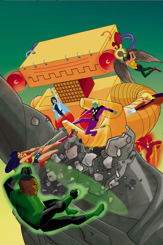
First off, we have all the Justice League thrown into one mighty visual. Were you working from a scripted story, or, like the previous two issues, were you working more on a less linear format?

Jones: Well, this issue was from a full script, as most of my work for DC Comics is. Issues #25 and #26, being drawn from a plot, were something of an anomaly. The script for this issue was by Josh Siegal, who had written the Martian Manhunter story for #10, and who also wrote a fantastic Phantom Stranger story that's coming up in a few months.

TZ: Did you have free reign on the specific actions of each character?

Jones: I think I had a little leeway in figuring out the specific actions of the League members in this shot. The main point was to have them fighting a giant robot. One of the actions that was specifically indicated was to have Hawkgirl saving bystanders rather than fighting the robot directly. This was important since the people she is telling the story to begin to question her effectiveness in battle next to the likes of Superman and Wonder Woman.

TZ: Do you find the more intricate one-image pages more or less difficult to finish than those with a sequential panel element?

Jones: It was probably a little more time consuming than some sequential panel pages. But sometimes those can get equally busy with detail or time-consuming to design.

TZ: When doing city shots like this, you have to be prepared to do what could be considered as pretty monotonous repetition -- for example, the intricate building on the left. Do you find it hard to concentrate on such repetitious design or is it something you enjoy?

Jones: If I was doing a lot of that sort of thing it could get kind of old. But doing a bunch of perspective work or something can be a welcome change of pace from a lot of body shapes or dialog scenes. Variety helps keep thing interesting.

TZ: In this page and throughout your work, you seem keen to explore different visual perspectives. Are there any angles you find more difficult than the rest? Do you look for visual approaches that test you as an artist or ones that you feel complement the script?

Jones: I find that changing the "camera angle" keeps the page looking more interesting, especially when doing a scene that is more dialog-driven and has little action in it.

Some of the first work I did for DC was on a title called Young Heroes in Love. There was a character in that group called Junior who was tiny -- around the size you usually see the Atom -- only he couldn't change size, he was just stuck that way. I always used to like doing shots focused on him, that made the other characters look like giants looming over him. I thought that sort of thing worked well for the character and helped keep the story interesting visually. That's the kind of thing I'm thinking about a lot when I'm designing a page.

TZ: Looking at the buildings! What research to you do when it comes to outside shots? Or do you work simple from you imagination?

Jones: It's a combination of imagined locales and ones taken from photographs. I find that basing locations on reality keeps me from falling into the trap of generic comic book locations -- cityscapes that look like shoeboxes with crossword puzzles taped to them and that sort of thing.

TZ: What advice would you give to artists trying to create exterior environments? In a confined panel, how do approach giving the illusion of space and season?

Jones: I always tell artists just starting out the same thing regarding characters and backgrounds: Look at reality. Whether it's looking at a photograph or looking at a live model sitting in front of you, it's important to start with how things look in the real world. A lot of bad comic book art has been produced by artists that seem to have learned to draw by looking at other comic books and took away all the wrong lessons. They end up drawing abstractions of abstractions.

The best trick I know of for creating an illusion of depth is forced perspective. If you think of having multiple planes of depth in a single image -- a foreground, a middle ground, and a background -- you can place things in each field that have a recognizable scale to them. By having small objects large in the foreground and large objects small in the background it really forces the reader to create an illusion of depth in their mind. It sounds simple, but it works!

TZ: Despite having to keep to the angular vision of the series, you seem to keep a fluidity to the characters. The first panel in particular seems a good example of this. Do you work from real life studies outside your comic work? As a comic illustrator, how important are real life drawings to your work?

Jones: It's funny, I didn't start out drawing like Bruce Timm. You could debate how successfully I do it when I try!

I've done a lot of work in other, more "conventional" art styles, and that definitely figures into my work on this series, even when I'm trying to draw the characters "on model" for their animated series designs. Furthermore, I feel like the more I can keep the backgrounds realistic-looking and full of life, the more it grounds these potentially cartoony-looking characters into a sort of reality.

TZ: We have 8 panels in this sequence, all with several characters. There seems to be a lot of information to gather and visualise here. What are the dangers when composing such a layout? How do you prevent it getting too confusing?

Jones: Thankfully the drawing style for this book allows for character designs that are simple and clean enough that it helps small panels from feeling too cluttered. Beyond that, you just try to do panel compositions that are very clear and reinforce the action you want to convey. Notice the way the bald character (Joe) is complaining to Hawkgirl. When she verbally smacks him down, I have her lean in to practically force him out of the panel. When he walks away past the rest of the group to sit in a chair and sulk, I tried to use the panel shapes to make him more isolated as he carries through with this action. I think it worked pretty well.

TZ: This issue has quite a few characters. Some are background roles, some are minor ones, and of course we have the main characters. When you have many characters for an issue, how do you approach them and in what different ways do you have to treat different characters?

Jones: This story features a number of young characters who have superpowers and are hoping to go on to be superheroes. But they're young and not yet ready (because they weren't taken in to be trained by Batman, I guess). So I wanted to give them a variety of facial and body shapes so they were distinct from each other, but also to make sure they looked young and that none of them were as big and impressive as even the slightest League members, who I guess would be Hawkgirl and the Flash.

TZ: Let's look at some of the model sheets you did for the guest characters for this issue. First we have Pandora and Joe. In regards to the young and not-quite-ready look to the new superheroes, Pandora and Joe stand out as unusual designs. Could you tell us a little about how you decided on their designs? How much of the design is yours and how much is the writer's? Pandora's design is particularly refreshing so far as heroes go.

Jones: Josh had some rough descriptions of how he wanted the characters to look. None of them were to have what looked like "professional" superhero costumes. Pandora's look as seen in this design actually got tweaked for use in the story. We gave him a T-shirt underneath his button-down shirt to make his look even more casual, and because I had the idea of giving him a shirt with DaVinci's "Proportions of Man" design on it, which is a bit of a visual joke given his power to project force field boxes. The things on his wrists changed as well, because I was a dunce and initially misunderstood their description.

TZ: Tell us a little bit about the evolution of the Psion design for this issue.

Jones: Well the script called for the Psions, a race from the DC universe with some history. Given that this was their first appearance in the animated universe, I saw this as an opportunity to revise their look a little, much like the designers for the TV show do when they bring in characters from the comics.

I felt that the existing comic book version of the Psions was a little plain -- average-looking guys with Star Trek-style ridges on their heads. I didn't want to alter the Psions so radically that they didn't seem like the same race, but I did alter their proportions a bit -- enlarged heads, smaller bodies. And I exaggerated the existing ridge pattern on both their heads and clothing to tie them in to the existing design. I'm pretty happy with the final result.

Toon Zone would like to thank both Christopher Jones and Dan Davis for kindly providing scans of their artwork to complement this interview.

Justice League Adventures#26 is still in the shops, Justice League Adventures #27 is out on the 7th January.

Interview Copyright: James McLean