
Comic artist Marc Campos has produced work for a multitude of different titles across the comic industry. He is currently inking for DC Action Comics. Based in Brazil, Marc Campos also runs a school for potential illustrators.
Marc, after doing the Toon Zone interview, kindly agreed to share some his wisdom with the Drawing Board. Below are examples of his students work.
This seemed a great opportunity for the teacher to share some of his insights with the Drawing Board into his students' work, as well as a chance for the Drawing Board to showcase some new upcoming Brazilian art.
Who knows? Maybe one of these students will be the next Marc Campos!
WEBERSON SANTIAGO
Weberson was one of our first students from when the school was still called Fábrica de Quadrinhos (something like “Comic Factory”). He was about 12 years old at that time. Weberson was one of our most stubborn students... always wanting to do things that didn't work...
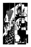
One of the things I always explain to the students is that many young artists have this urge to draw like their great idols. What they forget (at least as far as I believe) is every artist has their own natural approach... their own personal angle. A lot of times they want to draw like, for instance, Jim Lee, but their natural line points toward a different path. For me, it would be a pity not to see HOW this natural style will develop. Who knows if a student could turn out to be a new Sam Keith or Matt Wagner?
Of course, market trends exist and a lot of times the editors seek artists that have a style already popular with the readers (styles that don't look out of place). If we all thought like that, we would’ve never had artists such as Frank Miller or Mike Mignola in the market. What we try to do at Quanta is to show the students these two paths. Weberson, for instance, always tended to use a lot of shading. We taught him several uses of shading without compromising his natural line.
Very early on, I noticed that his work in high-contrast came out far better and often yielded very interesting results. Gradually, I showed him the work of other comic artists and in many occasions, showed him work that was not being published by the super-heroes mainstream. Little by little, we cleaned up those ingrained influences he had. I showed him some artists from the older generation (from the 1920’s, 30’s, and 40’s), many of them from the illustration market rather than just the comic market.
And here’s the result! A line style and color that shows several influences, but not to the point of compromising the authenticity of a work. Nowadays, Weberson is very much linked to the illustration scene, making work for the main Brazilian publishers.
THIAGO CRUZ
Thiago was very much like Weberson... also very stubborn in altering his technique. Even today, he has some problems in relation to light and shadow use - also with perspective and scene integration.
Thiago was far too tied to just one technique. It is what I call a “pencil code”. It is when a person creates a "language" in their personal line; as if each line is turned into a letter. Then, when a letter is linked to another, and then to another, and then another, they form a "word", resulting in a drawing that can be recognized by the reader. However, with Thiago, the line ended up being too two-dimensional... I wouldn't have anything against that, but in the comic book language - at least the kind of comic work that Thiago was inclined to do - this can sometimes hinder the storytelling.
We needed to make him learn how to apply style to specific sequences in a story. He needed to learn how to create the right timing and the right inclination to each scene, then see how they work as a sequence. The focus was to help him understand that when we have a style, an "imaging code," it will have to be constant in the universe of images we create. In other words, the line style that defines a character has to retain the same visual language throughout. Also, the same “accent” has to be there when defining cars, animals, buildings, shadow, clouds, and all else. That was a bit hard for him at first. The adaptation of his line to the use of color technique ended up to being a bit difficult for him because he lacked the knowledge of light and shadow when combining colors to create the “atmosphere” of a scene.

Nevertheless, Thiago caught on quickly when he realized that simplicity doesn’t always mean lack of effort. Sometimes you are afraid that one would think that you are using a certain color technique because you don’t know how to work with all the color features in Photoshop.
One of my personal mottos in regards to this issue is “Less is more”. Thiago has a natural feeling for illustration. He has great ideas in terms of how to visualize a concept and turn it into an image. However, he had some difficulties in establishing the sequence of scenes and how they would work altogether. Since each panel focuses on a specific moment of the story, Thiago needed to learn how these specific moments are sequentially read in order to convey both emotion and timing to the reader. That’s why we have had many conversations in which I've told him that each panel cannot be seen as an isolated illustration but as part of a sequence of events. Sometimes I feel that many artists are too technical and don’t take that into account. They see the panel as an opportunity to show virtuosity or an aesthetical impact, forgetting that it's more important that the scene has "timing". In many occasions, lack of "timing" impairs the reading. Comic panels are not pin-ups, they are not posters. Comic language is not just the language of illustration - it is something else entirely.
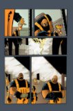
JEFFERSON COSTA
In the beginning Jefferson was very influenced by Manga. Way too influenced.
We tried not to eliminate this influence - he seemed to rely on it too much. The lessons are intended to bring knowledge to the students, open their minds and, show them other artistic possibilities.
In Brazil it is not difficult to become aware of different styles and influences. São Paulo is Brazil’s cultural capital. We have excellent museums and fantastic exhibitions. Besides, we have gigantic libraries, with huge collections.

I believe that our people lack the curiosity to know where their influences come from. I do not know if that happens in England or in the United States, but one should know that no artist has achieved a level in his art work without being influenced by another artist. To understand an artist's influence, research - it is a very good thing to do! One might end up discovering that their influence might’ve come from Da Vinci or Michelangelo!
Every artist has to go look at other styles. The ones who don’t lose the opportunity to advance both their knowledge and artistic personality.
Little by little, Jefferson started to enjoy looking at other illustrators and artists.
I remember a whole bunch of styling lessons I did. That was the time he made a complete U-turn and changed completely. I recall this specific lesson was on "image code". I was astonished by what happened to Jefferson at that occasion. I don’t believe he remembers it, but I was incredibly overjoyed when I realized what was happening to him that day. It was great! From that lesson on he started to study hard and polish up his own technique. Jefferson is very intuitive in terms of storytelling. He can establish sequences very easily and clearly. His storytelling is clean and naturally objective.
In the beginning, he presented some difficulty in how to build up the scene. Sometimes he would put in too many elements and that would impair the sequential timing a little bit. The color in Jefferson's pages were produced by Artur Fujita, a former student that is current teaching computer colorization. I’m a big fan of Fujita’s work. He has what I consider the most important skill in a good colorist: good taste when choosing colors and tones.
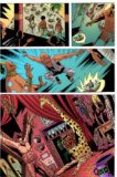
FERNANDO CINTRA (PQ)
Just like all others, Fernando was not my illustration student, but my comic drawing student. I was never a drawing teacher in my school. I only taught how to draw for comics. When he arrived his line was already very good but his work was too influenced by his teacher’s work, Eduardo Ferrara. Well, we had to change that! It took some time but I think it worked well. Today, he’s very influenced by the work of Genndy Tartakovsky... An excellent reference, although I have been speaking to him about “overinfluencing” and he’s been studying some other artists.
One of these artists is the Brazilian Flávio Colin, one of my favorites and whom I believe to have some similarity to Tartakovsky. Fernando uses a lot of simple objects (geometric or not) when building the panels. This helps until a certain point, but after the first sketch is done, you have to let your line loosen up in order to make the drawing move and flow. He has been working on this and I think his line is getting better.
RODRIGO ARRAIA
Again a stubborn student, probably the most stubborn student I’ve ever had! He also had pretty attentive ears as well! He was dedicated to every aspect of the drawing perspective, light and shadow. This resulted in some well built comic panels. Combined with all the graphic elements, he created scenarios which were very organic and interesting.
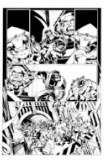
All the same, he was very shy about playing with different styles. Rodrigo has been working professionally for some time now, making publicity illustrations in a small agency. I found his art, in particular his natural line, was being buried under the lack of "artistic vision" from his clients. When I invited him to participate in the second album we were making, he came back with three pages ready, but very timid ones. We talked about it and I explained to him that he should take the opportunity to show his line the way it really was, I would not put any “restraints” on that! I still think the final result was a bit shy, but unquestionably much better.

The Students of Marc Campos
Marc Campos, Brazilian comic artist for DC Comics long running title, ACTION COMICS, is also a teacher in comic art at a Brazilian school for artists. Marc takes some time to showcase some of his pupils work and talks us through both artists and his techniques.
Interview copyright: James McLean
No comments:
Post a Comment